Your cart is currently empty!
Parts of a Comic Book Script Explained
Comic book scripts are a unique form of writing that provide a blueprint for the artist to bring the story to life visually. In this blog, I’ll walk you though the script for for my series Unborn as a case study for the parts of a script. Let’s break down the key components found in a typical comic script.
Quick Notes Before We Begin
Before we dive into the nuts and bolts of a comic script, there are a couple of…let’s call them ground rules that you, as the writer, should seriously consider if you want to make the best scripts you can and have the best collaborations you can.
Understand the Purpose
If you take nothing else away from this post, I want to impressed upon you, not for the last time, that the core purpose of your script is to convey a set of instructions.
Comic Script = Instructions
Your script exists to tell your collaborators, in simplest terms, what the vision for the story is. Anything in the script that does not serve that purpose is clutter and is a distraction. I know this is a bit draconian, but trust me, taking this very narrow view of what a script is and how it should function will make your life and the life of your collaborators easier.
Internalize the idea that less is more.
Strive for Clarity
I will stress this over and over again below, but it should be made clear before we even begin: clarity is the most important aspect of a comic book script.
The job of the script is to convey your vision as clearly as possible so the art team can do their jobs. Clarity in panel descriptions, dialogue tagging, and page/panel numbering is crucial and should be your main consideration when scripting.
Do Not Seek to Control
Some writers, especially young ones who’ve not collaborated much, can confuse their script with a list of demands rather than a flexible blueprint. The purpose of your script is not to control your collaborators and have them create the exact vision of your story you see in your head.
Collaboration is not about control. It’s about trust.
If you want a one-way relationship where others work under you and only do what you want how you want it done, go apply to be a manager at an Amazon warehouse.
But seriously, accepting and embracing the idea that your script is a flexible, breathing document that helps your collaborators execute the best shared vision of your story will make your collaborations better.
Macro-Structure of a Script
Okay, so the purpose of your script is to convey instructions to the artist, colorist, inker, and/or letterer. There are many tools and tricks for doing that well, but before we get into the those various parts of the script, let’s focus for a minute on the big picture.
There’s not a lot of theory on comic book scripts, but I like to think of them as having three sort of macro-level, which are:
- Tier 1: Top-level information
- Tier 2: Panels
- Tier 3: Lettering elements
Let’s dig into each of these.
Top-Level Information
Top-level information includes Title, Page Number, Panel Count, and Page Orientation. These are the elements of a script that you include to help situated your collaborators and, generally, make their lives easier. This is the “at a glance” information for navigating the script.
Panels
The secondary level of organization for your script is the Panel level, which includes Panel Numbers and Panel Descriptions. Panels, and the art within them, are the building blocks of the Page. With your script, your goal is to help your collaborators navigate each Page of your story with ease and clarity so that can bring the Page to life.
Lettering Elements
The final elements of script page are those that are lettered. These include dialogue, sound effects (SFX), captions, and narration. How you present these elements in your script, and how you use your script to (clearly) communicate your vision, will determine how effectively your collaborators can help you realize your vision.
All of these macro levels of a comic book script, and their various sub-elements, need to be understood and considered if you want to create a script that is useful and clear for your collaborators, which is the goal.
1. Title
The first part of any comic script is the title. A script, as it’s core, is a set of instructions for your collaborators and they should know what they’re working on. Depending on what script format you’re using, or what software, you’re title may appear in a different area of the top of the page, but always at the top.
Personally, I write in Google Docs. There’s a lot of reasons for this, but mainly I like that I can access my scripts anywhere and I can share them with collaborators in a way that allows real-time collaboration. Since Google Docs has a field at the top for a title/file name, that’s where I put the title.
2. Page Number
The highest organizational unit of a comic book script is the story page.
Because you are writing a document that is also a set of instructions for creating another document, there’s some room for confusion when it comes to pages. Your script will have pages that are describing other Pages. So for clarity’s sake, I will note “script page” and “story page” moving forward, to distinguish between the pages of script document and the pages that make up the comic book that is being created.
So when you are writing a script page for a Page of your comic book, you always want to indicate what page of your comic you are writing.
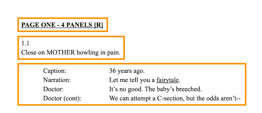
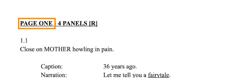
When you start scripting a new Page of your comic, you need to indicate that at the top of the page. As you can see, my script format puts this information, spelled out in call caps, on the very first line of the page. You can style this information any way your heart desires – PAGE ONE, Page One, Page 1 – but you should always note for your collaborators, especially the artist, when a new Page begins.
The Page Number pulls double duty letting the artist know when a page starts, but also that a page has ended. If the artist sees “PAGE TWO,” they know any information that follows does not belong to PAGE ONE.
3. Panel Count
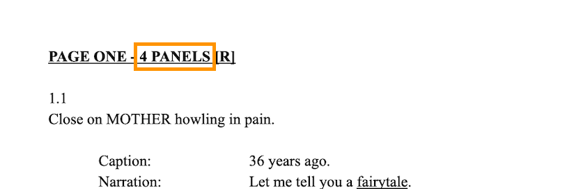
While not universally applied, I like to include the Panel Count for a Page right next to the Page Number.
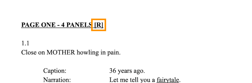
Panels, which I’ll discuss below, are the second level of organization for your script, so providing a Panel Count for your collaborators, when combined with the Page Number, acts as a shorthand for the structure of your Page. Before they even see the first panel description, an artist can see “PAGE ONE – 4 PANELS” and have at least a rudimentary idea of what the potential layouts for the Page might be and keep that in mind as they read the rest of the Page.
4. Page Orientation
The last key piece of information I like to include at the top of my scripts is the Page Orientation. I don’t know of many writers who include this information, but I think it’s really useful, and not very hard, to include.
A standard comic book Page will either face left or right when the printed comic book is open. Right facing Pages are, essentially, a barrier between readers of the next left-facing Page, so each Page Orientation offers you, as a writer, different effects.
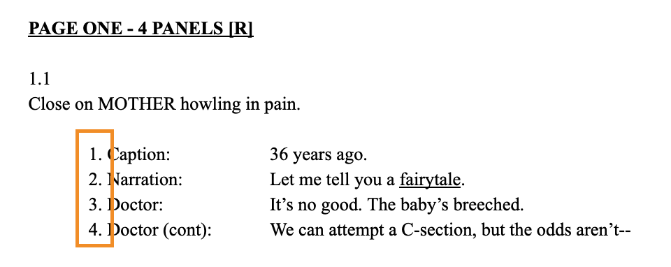
Right-facing Pages help with build-up and narrative momentum.
On the first Page of Unborn, we see the stakes raised as a woman gives birth. The doctor tells her that a procedure might kill her, but yells at him to “Do it!” The final Panel begs several questions: What’s going to happen? Will she die? Will the baby be okay? To get the answers to those questions, the reader has to turn the Page.
Left-facing pages, conversely, are about impacts and payoffs.
Say you’re working up to a big visual or key story beat, you might want to put that on a Splash Page to emphasize it. To give that Splash Page the greatest impact, you want it to appear on a left-facing Page. If you used the preceding right-facing Page to set up a strong Splash Page well, when the reader turns the Page, the Splash will have more of an impact.
These are all things that an artist has to consider when planning the Page. And by simply letting them know upfront whether a Page is left-facing or right-facing, you can make their job just a bit easier.
Again, there’s no best way to add this information. I just add “[L]” or “[R]” to the end of the Page Number / Panel Count info-dump at the start of a Page. So the formula becomes PAGE NUMBER – PANEL COUNT [PAGE ORIENTATION] or “PAGE ONE – 4 PANELS [R].”
5. Panel Numbers
Like the name implies, Panel Numbers are how you…number your panels on a story page. If there are four panels on a given story page, you would number them 1, 2, 3, and 4. This organizes the action neatly and helps your collaborators navigate the storytelling.
Even though scripts are read top-to-bottom, it’s still helpful to have the panels number. Generally, I try to keep one page of comics to one page of script, but that doesn’t always happen. So when the final panel of a given story page ends up on the next script page, there’s no confusion.
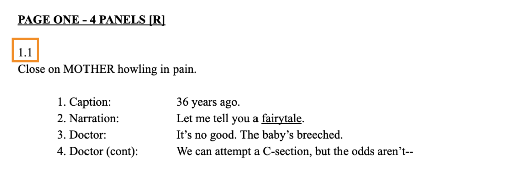
Some writers will put “Panel One” or “Panel 1.” As might be evident by now, I prefer simplicity and economy when scripting, so I opt for the for Page.Panel format (1.1, 1.2, 1.3, and so on). It provides the same information as “Panel 1” but I’ve found it makes collaborating even easier. When an artist needs to reference a specific panel on a page, the short hand “12.6” is at least as effect as “Page 12, Panel 6, but saves a lot of time.
There’s no “right” way to number your panels and the only wrong way is to not include them.
6. Panel Descriptions
Writing effective panel descriptions is an art (and different blog, really) unto itself. On the script page, panel descriptions need to give your collaborators the clearest sense of what the finished panel needs to look like. What is the action? Where and when is it taking place? Who’s there? Your panel description paints a picture for the artist to interpret on the story page.
The total number of Alan Moore’s script pages for Watchmen famously/allegedly clocked in at more than one thousand pages. Looking at the panel description for the first panel of the series, that’s not hard to believe:
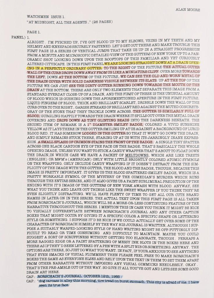
Moore’s brilliance as a writer is not in questions here, but looking at that wall of text, you’ve got to wonder how Dave Gibbons was supposed to decipher what what needed to be drawn.
There are two big reasons for that wall of text.
The first is that Moore is using some of that script real estate to speak directly to Gibbons. This script was written circa 1985, well before the modern digital age, so maybe some of this communication was helpful for building rapport back then. These days, we have so many options for instant digital communication that we can grow our relationships with collaborators very easily off of the script page.
The other reason is that Moore is providing A LOT of detail. Too much detail, clearly. We can see where Gibbons highlighted the important information. Everything else on that script page was secondary to Gibbons drawing the panel and, honestly, in the way.
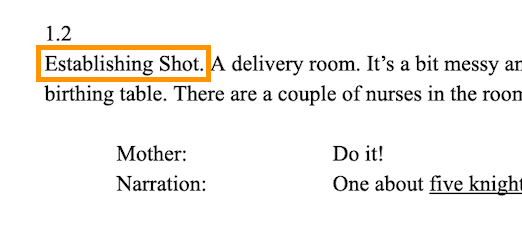
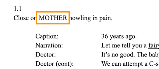
Now let’s look at a panel description I wrote for the first page of Unborn:
1.2
Establishing Shot. A delivery room. It’s a bit messy and it’s lit with flood lamps. DOCTOR is crouched at the end of the birthing table. There are a couple of nurses in the room to assist with the delivery.
Establishing Shot. A delivery room. It’s a bit messy and it’s lit with flood lamps. DOCTOR is crouched at the end of the birthing table. There are a couple of nurses in the room to assist with the delivery.
Look at how much information I was able to convey in a couple of fragments and two brief sentences — the type of shot, the setting, scene details, the characters present, and the action happening.
Again, economy and clarity. I’m pretty ruthless about making sure there’s no fat on my scripts, nothing that can distract my collaborators from understanding my vision and bring it to life with their incredible talents.
You might have noticed that the finished story page has has 1.1 and 1.2 reversed from the scripted version.
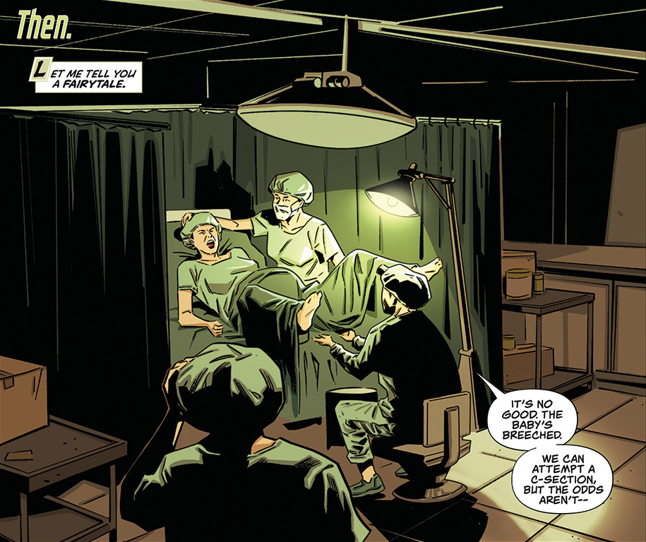
As he was creating the rough layout of this page, EV thought that this execution worked better on the page. Or how about the blood/afterbirth on the baby at the end of second page.
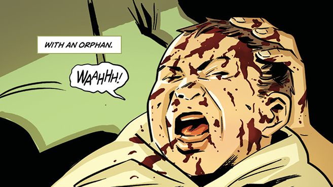
That’s not in the script (an oversight on my part). But because of modern technology, we were able to discuss the art. EV is a great artist and I trusted his skill. Even though the script wasn’t loaded with details, he still delivered.
That’s what good collaboration looks like.
So, if you were an artist in the 21st Century, who’s panel description do you think you’d prefer? Mine or Moore’s?
7. Camera Shots
Camera shots are a bit of parlance that’s carried over from filmmaking. They, essentially, tell the artist how to frame a specific panel.
Honestly, you should very rarely call out camera shots in your script. As I’ve mentioned already, you hire your artistic collaborator for their expertise. They’ve spent their life studying art. They’ve put in the very hard work to understand intuitively what the best camera angle for a panel is and you should trust that intuition.
I make one general exception to this rule for establishing shots. Establishing shots help me structure the the story page and to organize the story beats. But they’re a general-enough that the artist still has plenty of freedom to interpret how the scene is established.
I also make rare exceptions in which I will call out specific camera shots (or panel shapes) to achieve a specific effect on the page. But I can count on one hand the number of times I’ve done this and the serve to help the artist understand the effect I’d like to achieve. If an artist ever told me there was a better way, I would trust them. It’s happened and I have.
So, when in doubt, assume the artist will know better, anyway, and do not clutter your script with camera shots.
8. Characters
A crucial aspect of every panel description is the characters who are present. You will, of course, add your character to panels in the course of scripting. But how you choose to do it will determine how much utility your script has to offer.
To make my artist collaborators’ lives just a bit simpler, I put character names in all-caps:
Some writers will do this for the first time a character appears on a story page. I do it every time. That part is up to you.
But ultimately, capping your character names is an opportunity to make the script page more scannable and digestible for the artist without adding additional clutter to the script.
9. Lettering Lines
The script also contains all the dialogue that will appear in word balloons and captions. Dialogue is indented from the panel description to clearly separate the two.
Dialogue headings indicate which character is speaking (“Doctor:”). Dialogue is also numbered, a holdover from when balloon placement was indicated by numbers.
Parentheticals indicate dialogue delivery, like “(cont)” for a character continuing to speak in the next panel.
In our example, the doctor’s exclamation of “Almost there…” and the mother’s pained “Aiiiiiiiiieeee!” are called out in the script and appear verbatim in the final lettering.
10. Indentation
Indentation is something that will vary wildly from one script format to the next and I could write a lot of about the different ways comics writers have done it. But for the sake of keeping this posts (relatively) brief, I’ll just explain how and why I format my indentation.
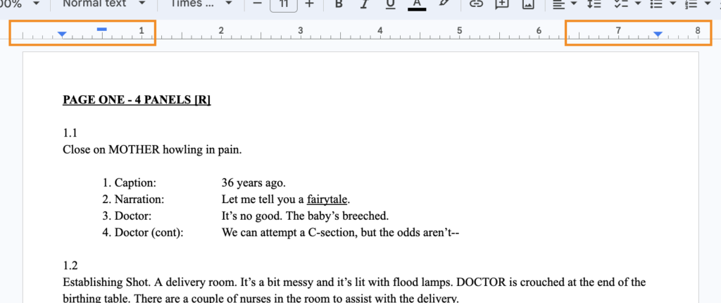
In the image above, you can see I’ve highlighted the rule on my Google Doc (always have your rule set to show). I’ve update my global settings for all documents to set my margins to 0.5 inches. This is a personal preference, but also serves a couple of formatting purposes.
In the above example, the Page Number, Panel Numbers, and Panel descriptions all align to the 0.5 inch margin on the left. When I hit enter/return to linebreak for my captions/narration/dialogue/etc., then, I use the first line indent (tab) to set these elements in another 0.5 inches. This creates a clear delineation between panel descriptions and lettered elements on the page.
Then, to create some delineation between lettering elements or character, I indented two more times, bringing the cursor to the 2-inch mark. This leaves enough space for parentheticals (more on these below) while leaving a clear line at which dialogue/SFX/etc. begin.
Of course, you don’t have to do it this way. The important take away here is to make sure you use indentation in a way that helps all of your collaborators navigate the script easily and that helps the letterer know exactly where the on-page content starts and ends.
11. Word Count & Balloon Size
I mentioned above that the 0.5 inch margins I use as a present has a purpose beyond intentional indentation — it helps me honest with how long my dialogue is.
You’ll notice that I’m not a very wordy writer most of the time. That’s on purpose. When my collaborators are creating such great art, I don’t want to cover it with needless words. So to combat my own over-writing, I’ve set up my document presets to keep me from over-writing.
As noted above, my dialogue starts at the 2-inch mark. On a document that is 8.5 inches wide, that gives me 6.5 digital inches for a line of dialogue to run before it carries on to the next line of the document.
As a rule, I do not let a line of dialogue carry on to a second line. And if a line runs over, I will revise and revise until I’ve found the best and most succinct way to deliver the line. Like 140-character Twitter back in the day, this makes me think hard about every word I put down. It also helps keep my story pages on a single page of script.
There are some well-known rules of thumb for word count and balloons:
- Use no more than 25 word per balloon
- If it takes you more than a breath to save a line, it’s too long
For my money, these two bits of wisdom are even a bit generous, but that’s my personal preference. Either way, my document settings and my no-more-than-one-line rule ensure that every line of my dialogue falls well-within these best practices.
Whichever way you choose to handle word count and balloon size, your goal should always be to present your collaborators with a clear and uncluttered script. Collaborators should easily be able to tell the difference between the character tag and the dialogue. If you’re doing that, then your golden.
12. Line Numbers
Line numbers are a count of how many lettering elements are on a given story page. All you have to do is add a number before the character/lettering element identifier on the line and increase that number for each line on a story page.
When I was starting out writing comic scripts, I numbered my lines because it was a guardrail against over-scripting. When you see the line number count hit twenty-two, it’s a good sign that you’ve probably got too much text on the page.
You will have noticed that I don’t actually use line numbers. With Unborn, my lettering collaborator actually asked me not to anymore because that was his preference. So, I’ve updated the first panel from page one of Unborn to show how line numbers are done:
As I mentioned, this helps you as the writer from over-scripting. It also makes letterers lives easier. Many letterers, most even, prefer line numbers and appreciate that they virtually eliminate any ambiguity about where the words should show up on the comic page.
13. Parentheticals
Parentheticals are, maybe, my favorite scripting tool. A thoughtful and well placed parenthetical, in a panel description or lettering line, can save you many, many necessary words and a lot of script real estate.
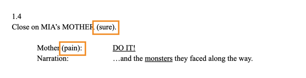
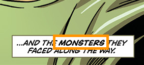
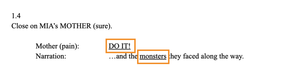
In the example above, you can see I used two parentheticals in panel 1.4. In the panel descripton I added the parenthetical (sure) to describe the Mother charater’s demeanor as it should appear in the art. I could have wrote “MOTHER is dead serious” or something even more detailed, but with a single word and a pair of parentheses I got the same effect. Arguable, I may have gotten a better effect because EV has more freedom to interpret and execute when he drew the panel.
Then, in the first lettering line, I used the parenthetical “(pain)” to describe to the letterer how Mother’s voice should sound in this panel. There’s a bit of a compounding effect on this line of dialogue because I chose to emphasize it (more on emphasize next) and put the dialogue in all-caps.
Maybe this instance was overkill, but you can’t argue with the results:
Parentheticals are one of the most powerful tools you have when scripting. They let you deliver key information to your collaborators, clearly and succinctly. Employ them regularly and thoughtfully and you won’t just make good comics. You’ll have better collaborations, too.
14. Emphasis
Emphasis refers to the words on a comic story page that are bolded or italics.
There are a few reasons to you might want to use emphasis:
- You want a reader to notice the words being emphasized.
- You want the emphasized dialogue to read with literal emphasis.
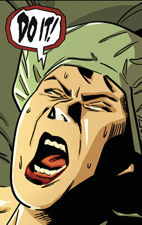
Some young writers will literally bold or italics the text in their scripts to let the letterer know to use emphasis, but this is not the best way. The generally accepted way to indicate emphasis in your script is by underlining, here:
Any letterer worth their salt will see your underlined text and know exactly what to do with it.
In the example above, I actually made a mistake. Two panels earlier, I had emphasized the line of dialogue “Do it!” Because the character is doubling down on the demand here, I wanted to really stress that to the letterer, so I added the line in all caps. While my intentions were pure, the all-caps text created a small problem.
In comics lettering, the capital “I” (with crossbars on top and bottom) is used exclusively for the pronoun usage of the word “I” referring to one’s self. Any other capitalized “I” uses a different form of the character without crossbars. So when the letterer copied and pasted the text from my script, the “I” in “it” used the wronger character. The issue was caught early and easily, so no harm, no foul. Still, the example is instructive.
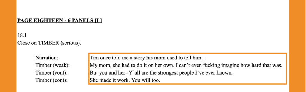
15. Sound Effects (SFX)
Sound effects (shortened often to SFX) are the lettering elements of your script that add onomatopoetic sounds to your comic. These are your “BANG” and “CRACK” sounds that add some auditory nuance to your story.
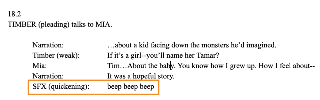
SFX are added on a lettering line, just line dialogue. And just like dialogue, they can be enhanced with parentheticals.
In the example above, the character Timber is on life support. Throughout, the scene, the reader sees/hears a heart monitor beeping. In panel 18.2, as the character is becoming more emotional, his heart rate is increasing, thus the beeping is “quickening” relative to the previous panel.
Note that the same rule about all-caps for emphasis applies to SFX. Instead, use emphasis and parentheticals to communicate to the art team the key information about the sounds in the scene.
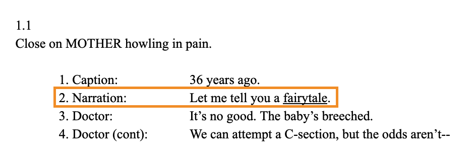
16. Captions
The term “captions” and “narration” are used kind of interchangeably among writers. For me, each is a different tool with a different purpose. Captions are, essentially, table setting. While they can be used artfully, they are exposition.
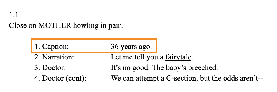
Captions are, generally, used to orient your reader in time or space. In the example above, I wanted the reader to understand that they are seeing a flashback that occurred 36 years ago. If the scene was taking place in New York and I wanted the reader to know that, I could have added a caption that read “Manhattan.” There are some more clever uses of captions in lots of comics for 99% of captions, you’ll be either telling your reader where or when the scene is occuring.
Just like dialogue and SFX, they go on a lettering line and use they same formatting as the other lettering line elements. Captions are one of the simpler elements we’re going to talk about in this post, and I don’t have anything very interesting to add, honestly. Just stick to the formatting best practices we’ve establish up to this point so to keep your collaborators’ lives easier.
17. Narration
And finally, we have narration. If captions are for orienting your reader, captions are for give your reader a look into the character’s mind.
As a device, narrations is, perhaps, my favorite item in the writer’s toolbox. It can be used to great effect, infusing irony, adding layers to the story playing out on the page, creating interesting juxtapositions, and more. Narration should (and will probably) be it’s own post. The topic is to large to cover meaningfully here, though.
I will say that a very good rule of thumb for narration is that if it’s happening on the page, it should not be happening in narration, too. Some writers will have their characters narrating their actions on the page, and that’s just redundant and it’s a missed opportunity to layer on something more interesting or to simply not cover up the art. Either is better than repeating yourself.
Format-wise, follow the rules for other lettering line elements for narration. Stack with parentheticals and emphasis if you like. For narration that is the speak directly narrating to the reader, do not use quotation marks. For narration that is dialogue in the story, use the prose rules for dialogue. That’s really it.
Final Thoughts
Understanding the key components and structure of a comic book script is essential for crafting clear, inspiring blueprints for your creative team. By focusing on clarity, using consistent formatting, and thoughtfully employing tools like parentheticals and emphasis, you can write scripts that effectively convey your story vision while empowering your collaborators to do their best work.
The pages from Unborn demonstrate how these scriptwriting principles translate to the finished comic page. The concise panel descriptions, clearly tagged dialogue, and judicious use of emphasis provide the artist, letterer, and colorist with the essential information they need to bring the story to life, without extraneous details that limit their creative interpretation.
Studying the building blocks of a comic script and seeing how they flow from the page to the final art is invaluable for aspiring comics writers. Master these fundamentals, and you’ll be well on your way to writing compelling, collaborative scripts. Happy scripting!
[ez-toc-widget-sticky]
Frank Gogol is a San Francisco-based comic book writer. He is the writer of Dead End Kids (2019), GRIEF (2018), No Heroine (2020), Dead End Kids: The Suburban Job (2021), and Unborn (2021) as well as his work on the Power Rangers franchise.
Gogol’s first book, GRIEF, was nominated for the Ringo Award for Best Anthology in 2019. Gogol and his second book, Dead End Kids, were named Best Writer and Best New Series of 2019, respectively, by the Independent Creator Awards.
